
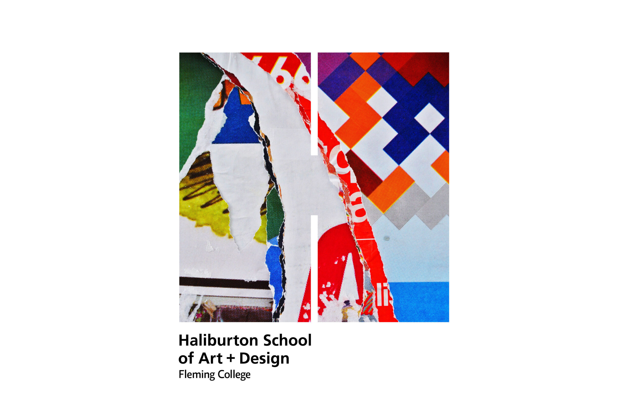
HSAD Identity
Formerly known as the Haliburton School of The Arts, Fleming College introduced the new name and brand to better reflect the blend of art, design and heritage programs offered within the School.
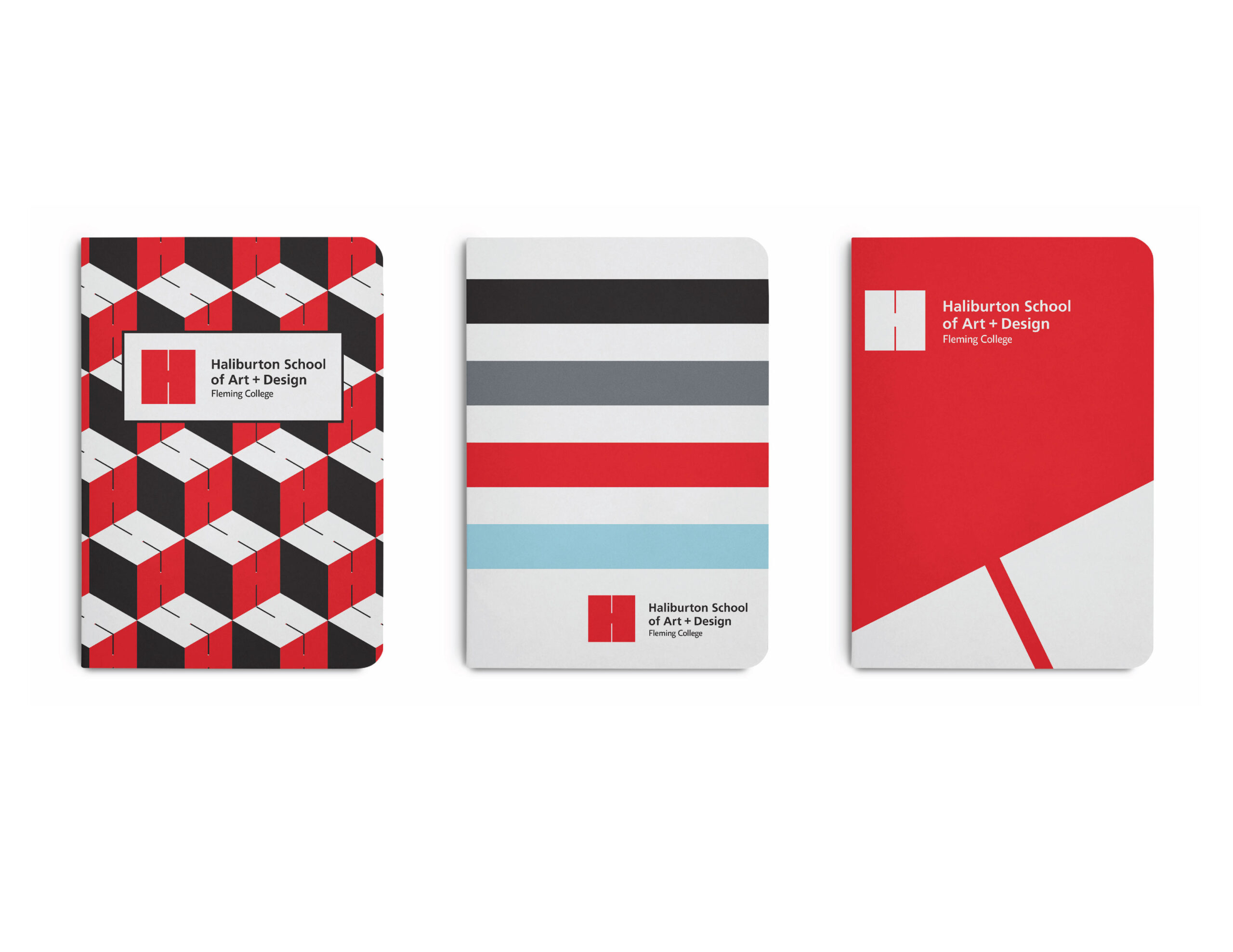
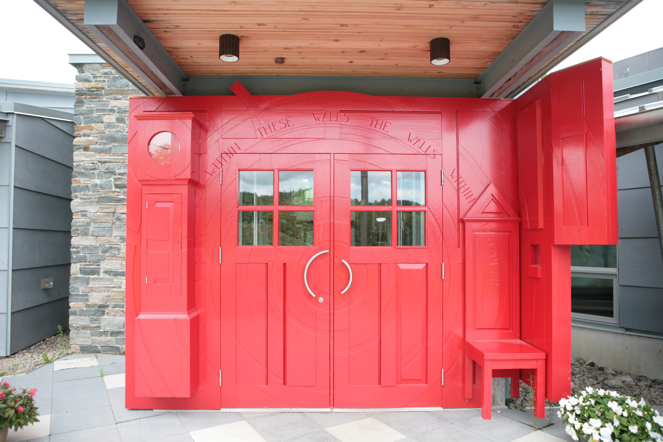
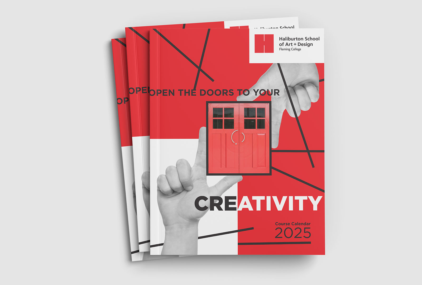
The new visual identity, was inspired by the iconic Haliburton Campus red doors that symbolize the opening of creative possibilities for students in all programs, and the School’s longstanding history in providing art education since 1968. The addition of + Design denotes the School’s unique suite of integrated programs that fuse hands-on studio art practices with design studies.
“It looks elegant and minimal on its own as a logo, but can also be transformed into a pattern or a graphic image… I also love that despite its minimalism it still has personality and is personalized to the school by referencing the red doors. Lastly, the execution and typography are all tight. The typeface choice balances well with the heavy “H” graphic and feels appropriate for a design school,” said RGD award judge Sabrina Majeed.

Winner – RGD In-House Design Award